
Given the week we had in terms of news, social media, angst and more, I figured we could all use a bit of humor…
When you find yourself struggling with your journalism work and wondering if there will be a job for you at the end of this whole endeavor, cheer up and realize that being even marginally good at writing, reporting and thinking will put you ahead of some of these people.
Graphical Gaffes
You might remember a few years back when Rep. Jason Chaffetz, R-Utah, used this chart as part of a hearing on Planned Parenthood, in an attempt to show a spike in abortion provision and a drop in cancer screens at the organization’s clinics:

You might also recall that it led to some serious derision by people who understand how graphics are supposed to work. The larger numbers are lower than the smaller numbers in 2013, the lines go in an uninterrupted pattern of incline or decline (something that rarely happens with data) and no data points exist other than the first and last years. Politifact also noted that the chart has no Y axis and one journalist took it a step further, stating, “This is not how charts work!”
Here in the great state of Wisconsin, our outgoing governor, Scott Walker, decided to one-up Chaffetz with a graphic intent on explaining how a lame-duck legislative session didn’t really undermine his successor, Tony Evers. Walker, a Republican, provided a Venn Diagram (a term I’m using loosely here) to show that even though he signed off on legislation that shifted power away from Evers, a Democrat, and back to the Republican-led legislature, his powers and Evers’ powers were essentially the same.

For those of you unfamiliar with how Venn diagrams are supposed to work, consider this simple one:

In other words, the overlap is where things are similar, with the differences being on the outside. I have no idea what Walker’s chart shows, other than this isn’t how charts are supposed to work.
Support, not repeat:
When you put together a paraphrase-quote pairing, the goal is to have a strong paraphrase that establishes who will be speaking and the topic upon which that person will speak. The quote should add value and perhaps even some “spice” to the piece. What you shouldn’t do is give your readers the sense they are living in “Groundhog Day” like this one:
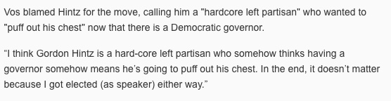
I’m not sure if I should be more worried that the partial quotes are EXACTLY the same as they are in the full quote below, or if the reporter went with “hardcore” and “hard-core” in subsequent paragraphs. I am a freak for hyphenation…
It’s a lead, not an allegory.
Leads are meant to have as much good information packed into them as possible. That said, we tend to think of 25 to 35 words as the range for one of these things. Another tip I often offer is to take a normal human breath and read it aloud. If you feel tight at the end of it, or you run out of breath entirely, you probably need to trim it or cut it.
Try that with this lead and you’ll likely need some smelling salts or CPR:
BOSTON — Celtics guard Kyrie Irving said that in the wake of his outbursts at coach Brad Stevens and forward Gordon Hayward on the court at the end of Saturday’s loss at the Orlando Magic, and pointed criticisms of Boston’s young players afterward, he called LeBron James and apologized for the way he handled criticism from James when the two were teammates in Cleveland.
Not counting the dateline, you’re looking at 63 words or more than double the low end of a solid lead. It wouldn’t take much to get this thing down to that range, particularly if the writer didn’t feel it necessary to outline Irving’s transgressions in granular detail right up top.
Remember, tell people what happened, but don’t overload their brains in doing it.
Wait for it… Keep waiting…
Some stories are so horrifying, it’s hard to get everything into the lead. Not to say that journalists don’t try:
WAUSAU – The Wausau baby sitter charged with killing a 2-month-old boy in her care tried to hide the infant’s death from his mother and then went swimming at a Wausau hotel with her boyfriend and son, police say.
There’s a lot to freak out about here when it comes to the arrest of Marissa Tietsort, (this all happened in Wausau, in case you didn’t get that from the three mentions of it up there) but if you keep reading you’ll find out a few other things that are problematic that get stuck a little too low, like this one in the fifth paragraph:
Tietsort has been in jail since October on a $250,000 cash bond in a separate child abuse case.
Or this, which is about two sentences from the bottom of the nearly 1,000-word story:
In 2010, Tietsort’s boyfriend filed for temporary restraining orders after he told investigators she was abusing their two sons. Records show social services workers have removed four of Tietsort’s children from her care and were unaware that she had given birth to her fifth child.
Annnd this, which is the second-to-last sentence in the whole piece:
Tietsort is now in the Marathon County Jail and pregnant with her sixth child.
I’m thinking this could be information worth knowing a little bit earlier in the story…
It feels kind of like this:
Speaking of placement…
Sometimes stories and images have issues when they are put too close to one another. This is the case in which a criminal investigation and nice feature photo led to a question about what’s in your sandwich:

I’m still not going vegan, but this set up does give me pause.
My name is Forrest… Forrest Management
Typos can really do you in, even if you are the president.

(The tweet was later corrected. That doesn’t make me feel any better. Neither did his “hamberders” tweet. I don’t care which political party you support. I support spelling and editing.)
Good Head + Good Deck – Common Sense = Bad Example
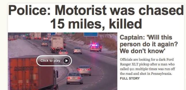
Unless we are fearful of a zombie driver, I think it’s safe to say this guy isn’t going to do this again, Captain Whoeveryouare.